



9 hours ago
Took a peek, and, to be honest, this one looks genuinely good.
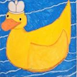
Obviously the OG Kiki icon was never made for the 1.2 Kiki (which, despite having eye/mouth animations, still needs a redesign). Meanwhile, your redesign actually seems to be way more suitable for the current model, and I doubt it wouldn't be for STKE either.
Regarding the general icon style, try some slightly thicker outlines to make it more suitable.
Obviously the OG Kiki icon was never made for the 1.2 Kiki (which, despite having eye/mouth animations, still needs a redesign). Meanwhile, your redesign actually seems to be way more suitable for the current model, and I doubt it wouldn't be for STKE either.
Regarding the general icon style, try some slightly thicker outlines to make it more suitable.
Kawa kawa kevasak, kawa kawa qua-qua-quack!